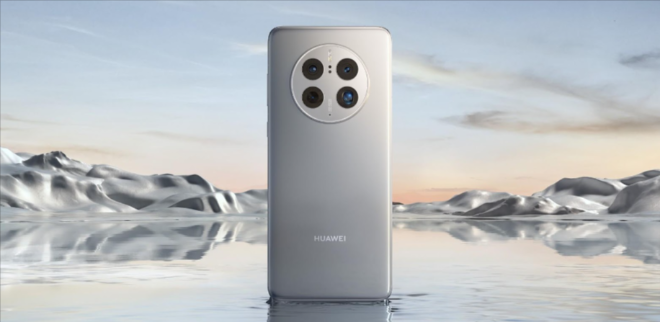
A few weeks ago, Huawei presented its new flagship, the Huawei Mate 50 Pro, of which we already left some frankly favorable opinions about its photographic section.
Now, after a couple of weeks of use, I have already had the opportunity to put it to the test in all its sections and I am going to say it clearly: it is one of the best devices that have passed through my hands this year.
It is also true that it is a flagship that is placed above the barrier of 1,000 euros and that it leaves Google services aside, something Huawei has been fighting against for some years now, but I think it is less and less of a problem. Serious for the enormous effort of the Chinese company to improve its own software.
An exceptional design that stands out for that spectacular circular camera module, although it gets dirty easily.
The huawei mate 50 pro maintains the same line as the Mate 40 Pro that I already had the opportunity to test at the end of 2020. That is, that premium aesthetic that exudes elegance and personality everywhere, as well as that circular design of the rear cameras.
Of course, this inner circle is left aside here, but the commitment to maintain the same color of the device in the module —in my case, the color silver, although you have the option in black—, which manages to give it greater prominence and makes it very clear that you are facing a Mate 50 Pro.
The positive side is that it does not shake when you leave it on a surface, although it is true that it remains slightly elevated. The negative side, for its part, is that it gets dirty easily and leaves many traces.
The button panel, for its part, remains in the upper right part and in my case I think it is too high. The same is because of the size of my hand, but it has not been very natural for me to play with the volume up and down button. The lock button, yes, -with a very nice orange detail- is perfectly located on the thumb.
For the rest, the USB-C connection, the SIM slot and the audio output at the bottom, which performs quite well, it must be said, as well as a slightly above average weight —which becomes somewhat uncomfortable in the first few minutes until you get used to it—which it compensates with a perfect grip that does not slip and adapts perfectly.
Outstanding, fluid screen with an exquisite color representation, although I did not like the commitment to the notch.
As for the screen, it is an absolute delight. One of the best that have passed through my hands this year, come on.
A 6.74-inch OLED panel with 2616×1212 resolution with a 120hz refresh rate and a 300 hz touch sampling frequency. That is to say, a screen full of color, with an excellent representation, full of vivid colors and very well represented in all kinds of scenarios, extreme fluidity in navigation and a response to the touch —especially in the gaming field— simply exceptional.
The maximum brightness, for its part, also rounds off the experience with outstanding behavior, to which is added an excellent automatic brightness that adapts to each scenario with exquisite solvency.
The only 2 negative points that I see, although I think it is a matter of taste more than anything, are in its curved screen and in the solution of its selfie camera.
With respect to the first point, it does give the sensation of being in front of an infinite panel, but it suffers from that endemic problem of curved panels: a slight change in color at the edges, although it is true that it is being better solved every time.
As for the second point, I don’t know if it’s a step back or forward, since instead of a hole in the screen, it opts for a notch like the one on the iPhone. As I said, it’s a matter of taste, since depending on the situation I think it makes better use of the panel, but you still prefer a more concealed hole.


Your point of view caught my eye and was very interesting. Thanks. I have a question for you.
Thank you for your sharing. I am worried that I lack creative ideas. It is your article that makes me full of hope. Thank you. But, I have a question, can you help me?
Thank you for your sharing. I am worried that I lack creative ideas. It is your article that makes me full of hope. Thank you. But, I have a question, can you help me? https://www.binance.info/en-IN/register?ref=UM6SMJM3