Nowadays, devices such as tablets, laptops and smartphones are the latest obsession of the business world.One of the primary reasons behind this obsession is because everyone is more reliant on technology with the arrival of these well-equipped devices, different apps, and software. As an entrepreneur, I take advantage of this tech advancement in the 21st century because they make thing easier. Currently, we have millions of online tools to help us perform our daily routine tasks in a functional way; whether it’s looking through email in Gmail, Outlook or finding docs in cloud storage services such as Dropbox, Google Drive. Despite having appropriate tools for every daily task, we do not have many options when it comes to project management. There are useful features in tools like Liquid Planner and Smartsheet which offer online project management tools but without software integration features these tools can only go so far. But don’t worry! Now, there is an app called “Wrike” which provides a complete package for managing projects and tasks. Founded in 2006, Wrike is an online project management application service provider based in San Jose, California.
Wrike came out with an easy solution for managing projects through your Android app. And this particular article is dedicated to the Wrike app review; where its pros and cons and how to use it in an easy manner.
We will discuss the different aspects of this app in the review below:
Design & UI of App
I have done a ton of app reviews in the last two years which include different kinds of apps such as transport app, traffic apps, food ordering apps and gaming apps. I edge the relevancy of an app in numerous parameters with“Design & UI” as one of the most significant parameters. I have always mentioned in my app reviews that design and user-interface are the most crucial part of any app. And after using Wrike’s app for the couple of days, I’m thoroughly impressed. The app developers of Wrike did a great job in making the app ingenious and easy to use. In terms of technicality of the app, there was no lag while using the app and it loads very smoothly.
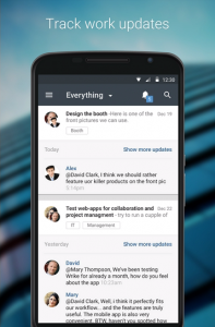
User-interface of the app is also user-friendly and intuitive.. I should also mention the company scored high in the design and construction of its user-interface because of how easy it is to navigate through various tabs. Wrike has also added a function in the “My Work” section of the app where users can add their planned tasks on a weekly basis. Users are also able to attach documents and files from Google drive or Dropbox in their tasks and can share those tasks with other collaborators.
Structure of App
Now, I will explain the objective of the app and how to use it in an easy and productive way. The app was able to encompass the essential features from the desktop version of Wrike’s project management tools and assists you in managing tasks and projects all on your smart phone.
The app is available for free on Google Play as well as iTunes. In order to use the app, you are required to own an Android or iPhone. Once you log in, you’ll be able to see tasks created by you for this week, next week or later. If no tasks are created, it will ask you to add one (optional). The app also contains a search bar where you can search for your existing. There is also a notification center where you can see notifications from your inbox or mentions. Download the app on Google Play.
Verdict
Overall the app is an ideal candidate for those who are looking for a project management app on their smartphones. In my opinion, the app is a friendly project management ecosystem with a user-friendly interface.
Pros
- Responsive User-Interface
- App Loads Smoothly
Cons
- Design Is Basic
[wp-review]


